Storyboard for Data Visualisation

Storyboard Text
- 1. Exploring the Data
- 2. Finding Key Insights
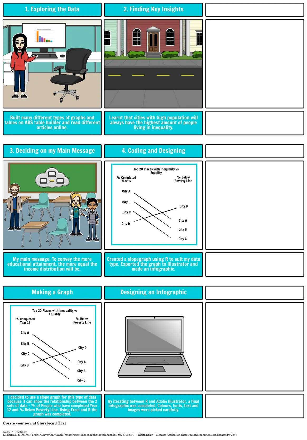
- Built many different types of graphs and tables on ABS table builder and read different articles online.
- 3. Deciding on my Main Message
- Learnt that cities with high population will always have the highest amount of people living in inequality.
- 4. Coding and Designing
- City A
- % Completed Year 12
- Top 20 Places with Inequality vs Equality
- % Below Poverty Line
- My main message: To convey the more educational attainment, the more equal the income distribution will be.
- Created a slopegraph using R to suit my data type. Exported the graph to Illustrator and made an infographic.
- City D
- City B
- City C
- City B
- City C
- City A
- City D
- Making a Graph
- City D
- City A
- % Completed Year 12
- City B
- City C
- Top 20 Places with Inequality vs Equality
- City B
- City A
- % Below Poverty Line
- City D
- Designing an Infographic
- I decided to use a slope graph for this type of data because it can show the relationship between the 2 sets of data - % of People who have completed Year 12 and % Below Poverty Line. Using Excel and R the graph was completed.
- City C
- By iterating between R and Adobe Illustrator, a final infographic was completed. Colours, fonts, text and images were picked carefully.
Image Attributions
- DealerELITE Internet Trainer Survey Bar Graph - DigitalRalph - (License Attribution )
Over 40 Million Storyboards Created
No Downloads, No Credit Card, and No Login Needed to Try!
